“Can you just make me a logo?”
I’ve heard some version of that question probably four hundred times in twenty-some years of doing this. And every time, I have to slow the client down, because a logo isn’t one thing. It’s a category. Like “vehicle.” A motorcycle and a dump truck are both vehicles. You wouldn’t haul gravel on a motorcycle, and you wouldn’t commute on a dump truck. Same logic applies here, and almost nobody thinks about it until something goes wrong.
So let’s go through the actual types, and where each one earns its keep.
Wordmarks.
Just your name, styled. Coca-Cola. FedEx. If your business name is short and sticky, this works hard for you — people read it and remember it in one pass. If your name is six words long, skip this one.
Lettermarks.
Initials. IBM, HBO. These are a trap for new businesses, honestly. Initials only work once people already know what they stand for. Slap three letters on a sign for a business nobody’s heard of yet, and you’ve made a logo that means nothing to anyone. I usually steer first-time clients away from this unless there’s a really strong reason.
Brand marks
Symbol only, no text. The Apple. The Twitter bird (RIP, sort of). These look incredible in a portfolio and take years, sometimes a decade, of repetition before they actually function without the name attached. I had a client insist on going icon-only in year one. Six months later he was adding the name back in because customers kept asking what the logo even was.
Combination marks.
Icon plus name together. This is the safe, smart default for most small businesses, full stop. You get flexibility — full lockup on the storefront, icon alone for the Instagram avatar or the app favicon. Nine times out of ten, this is where I land a new client.
Emblems.
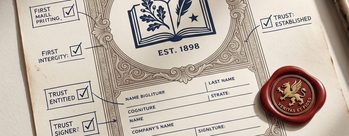
Name inside a badge or seal — breweries, schools, coffee roasters lean on this. Reads traditional, established, a little old-world. Great if that’s your brand. Terrible if you need it to shrink down to a 32-pixel favicon, because all that fine detail just turns to mud at small sizes. I’ve had to talk more than one client out of an emblem once they realized it looked like a smear of ink on their phone screen.
Here’s the mistake, and I see it constantly
Someone picks a logo type because it looked good on a mood board. Not because it matches where the brand actually has to live. If 80% of your customer contact happens through an Instagram profile picture the size of a dime, a detailed emblem just isn’t going to survive that. Figure out where your brand shows up first. Sign, invoice, social profile, truck door. Then let that decide the format. Not the other way around.
Not sure which bucket you’re in? That’s a fifteen-minute conversation, not a guessing game. Reach out to us at Brightwork Consulting & Thr3e Designs Studios — no pressure, no upsell, just a straight answer.