Ask ten business owners why they picked their brand colors and eight will say “I just liked it”. That’s how most of these decisions get made. It’s also why a lot of small business branding does nothing to actually help the sale.
Color isn’t decoration.
It’s information your brain processes before language even kicks in. Someone forms a judgment off your palette before they’ve read your tagline. Here’s roughly how that judgment breaks down — and where each color actually earns its place.
Blue reads trustworthy, steady. Banks, healthcare, tech all lean on it — it’s the “we won’t mess this up” color. Downside: everyone else is using it too. If your whole category is blue, blue stops doing any work for you specifically.
Red creates urgency. Appetite, even — it’s not a myth, red genuinely stimulates hunger, which is why food brands love it. In large doses it gets loud fast, though. All-red can read as aggressive rather than confident.
Green signals growth, health, money. Solid for wellness, finance, sustainability. Drift the shade too far toward yellow-green and it stops reading as “organic” and starts reading as “clearance rack.”
Yellow grabs attention, reads optimistic. Brutal as a dominant color though — hard on the eyes in large fields, tricky to pair with readable text. Use it as an accent. Never the foundation.
Black reads premium. Restraint itself signals expense, which is why luxury brands camp out here. Risk: cold. Black-heavy branding without a warm accent somewhere can feel closed off instead of upscale.
Orange is friendly, energetic, without red’s edge. Good for brands that want approachable-and-active rather than urgent.
Here’s what actually matters, though.
It’s not about finding “the correct color” in a vacuum. It’s about picking a color nobody else in your category is using. If every plumber in town is the same shade of blue, a confident orange might be the exact thing that makes you the one people remember when they’re scrolling past five identical-looking trucks.
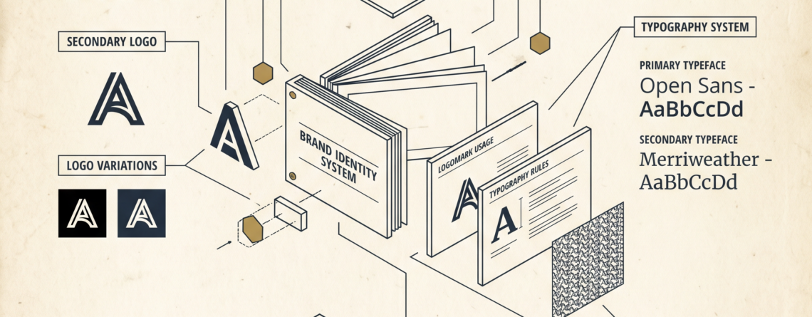
And consistency beats the specific shade, every time. Same blue on the website, the truck, the uniforms, the invoices — that builds recognition over months. Five slightly different blues because five different people touched the brand over the years? That builds nothing. People learn to recognize you the way they learn a stop sign. Repetition, not artistry.
One more thing, technical but worth knowing: color shifts between screen and print, and even between devices. What looks right on your monitor can come out muddy on a printed banner or shift on a phone screen. Worth catching before you’ve ordered five thousand business cards in the wrong shade.
Ask me how I know.
If your current palette was chosen by gut feeling rather than strategy, that’s a fixable thing — doesn’t mean starting your whole brand over. Get in touch with Brightwork Consulting & Thr3e Designs Studio and we’ll look at what your colors are currently saying, and whether that’s actually the message you want out there.